


Script Tattoo Fonts: Choosing Lettering That Lasts
How to choose a script tattoo font that stays readable: lettering styles, size and spacing, spelling checks and the best placements for words.

A script tattoo looks simple, which is exactly why it goes wrong so often. The font, the size, the spacing between letters and the spelling all decide whether a word stays readable for years or blurs into a line. Here is how we help clients choose script tattoo fonts that last, how small fine line script can go, and which placements suit words best.
Choosing a script tattoo font
Most lettering tattoo fonts fall into a few families. Each one ages differently.
- Cursive and handwritten script. Joined, flowing letters. Elegant and personal, but loops can close up if they are tight. Best with a little size and generous spacing.
- Typewriter and serif. Separate letters with small feet. Clean and classic, and the gaps between letters help them stay clear.
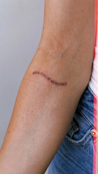
- Sans serif and minimal print. Simple, even strokes. The most legible at small sizes.
- Fine line calligraphy. Thin and thick strokes, like a pen nib. Beautiful at medium size; needs room for the contrast to show.
- Gothic and blackletter. Heavy, dense letters. Bold and readable from a distance, but needs bigger lettering because of the detail inside each letter.
- Your own handwriting, or someone else's. A name in a parent's handwriting, a word from a letter. Custom design is included, so it can be adapted to tattoo well.
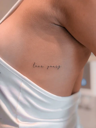
When you pick a font from your phone, look at it at real size, not zoomed in. Print the word at the size you want, hold it on your arm, and step back. If you cannot read it from a metre away, it will be harder to read in five years.
How small can script be?
Everyone wants small lettering. The honest answer is that the minimum size depends on the font and the number of letters, and your artist can advise once they see your design.
General rules that hold for every font:
- Open letters go smaller than tight ones. An "e" or an "a" with a small loop is the first to close up.
- Fewer letters go smaller. One short word can be tiny; a full sentence needs room.
- Spacing matters as much as size. Letters tattooed too close merge as the lines soften.
- Fine line script softens. Every tattoo spreads a little over time. Our article on whether fine line tattoos age well explains why.
If your word does not fit at the size you want, a simpler font or a slightly bigger size is the better choice. See our fine line tattoos.
Have the words and a font in mind? Send us both on WhatsApp, with the placement, and get a price the same day. Our Canggu studio in Pererenan is open daily from 9am to 9pm.
Spelling and language checks
A typo in ink is the one mistake you cannot laugh off. Before the stencil goes on:
- Send the exact text in writing. Not a voice note. Copy and paste it into WhatsApp.
- Check other languages with a native speaker. Translation apps get tattoo phrases wrong all the time, especially accents, gender and word order.
- Check accents and special characters. É, ñ, ç and apostrophes change the meaning.
- Check dates and numbers twice. If you want Roman numerals, convert them carefully and get someone else to check.
- Read the stencil before it goes on. Out loud, letter by letter. Take your time.
Scripts in other alphabets, such as Balinese, Sanskrit or Japanese, need extra care. Bring the text from a trusted source and confirm its meaning before you book.
Placement for words
Words need a line to sit on. The body gives you plenty:
- Inner forearm. Easy to read for you and others.
- Along the collarbone. A short phrase that follows the bone.
- Ribs. Long lines of script sit beautifully here, though the ribs are one of the more sensitive spots.
- Spine. A vertical word or phrase. Striking, but harder for you to see.
- Above the elbow or on the back of the arm. Good for a single word.
- Top of the foot or the hand. Pretty, but these are high-friction spots, so keep script bold and simple there.
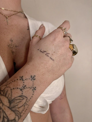
Do you want to read it yourself, or should others read it? Script on the inner forearm faces you; on the outer forearm it faces everyone else. Decide before the stencil goes on. See our placement guide before you choose, and our lettering for more examples.
Price
At Amor Fati, small pieces start from IDR 850,000, and a single word or a name usually sits at the small end. Longer phrases and detailed calligraphy cost more. We price per design, never per hour, and custom lettering design is included. See the full price guide.
Send us the exact words, a font reference and where you want it on WhatsApp, and you will get an honest price range the same day. Uluwatu and Seminyak are on the studio page.
Can I bring my own font for a script tattoo? Yes. Send us the font name or a screenshot of the lettering you like. Custom design is included, so the lettering can be drawn to suit your placement, and you approve it before we start.
What is the smallest readable script tattoo? It depends on the font and how many letters there are. Simple, open lettering can go smaller than tight cursive. Your artist can tell you the smallest size that suits your font, and whether a bigger size or a simpler font would work better.
Should I get my script tattoo in my handwriting? It can be beautiful, especially for a name or a note from someone you love. Send a clear photo of the writing on white paper. Custom design is included, so the writing can be adapted to tattoo well while keeping its character.
How much does a script tattoo cost in Bali? At Amor Fati, small pieces start from IDR 850,000, and short words or names usually sit at the small end. Longer phrases cost more. We price per design, never per hour.


